Website Redesign for the Iowa Tech Chicks
As a volunteer for the Iowa Tech Chicks, I initiated, designed and implemented their website redesign. First, a little background. The Iowa Tech Chicks is a nonprofit organization based in Iowa City, Iowa. It exists to support and advocate for women and girls in technology in the Iowa City area. I became a member in 2013 and was the Executive Director from 2018 – 2020.
In addition to planning meetings and events for the organization, writing and administering grants, we took on a website redesign a couple of years ago. This was an unpaid project I took on to so I could sharpen my visual design skills in a low stakes environment.
Note. Screenshots for this post were pulled from the Internet Archive’s Wayback Machine. Unfortunately, the website no longer exists, as the organization is changing leadership and focus.
The Challenge
The original website, which hadn’t changed much since 2013, was feeling quite stale.

At some point, our former executive director worked with a local graphic designer to create a logo for us. That was better, but the website could still be improved.
To be honest, we were all too busy staffing STEM booths, planning Girls Tech events, and sponsoring Girls Who Code Clubs to focus too much on our website. At some point, I decided it was time to take on a website redesign.
What I Did
Since we were a small organization with no paid staff, I worked with our Board of Directors to plan the structure of the updated site.
The first thing I did was grab a whiteboard marker and start sketching out a new structure. This took about 20-30 minutes since the site was rather straightforward and I’d been itching to improve it for a while.
- Since our organization also held professional development events for women, we wanted to make a main navigation path for women.
- Another small improvement was to put the About page front and center. This is key information for non-profits like ours, and it was previously buried under Contact Us.
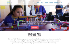
- The existing site had a carousel header, which made the site look busy and less professional. We planned to switch to a hero image with a main call-to-action button instead.
The main goal of the home page redesign was to orient our audience to our organization so they could understand what we were all about. We needed to answer two key questions;
- Why does this organization exist?
- and Why should I care?
After working with board of directors to ensure the redesign represented all of our goals, I created a design concept.

- Although our logo has pink and purple in it, I wanted to avoid going overboard with those colors to avoid an overly cutesy visual style. The blue from the logo became our main color, and lime green and pink were accent colors.
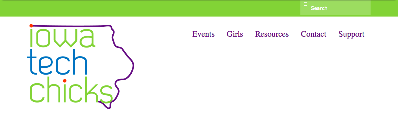
- To ensure the logo and navigation would always stand out, I added a new navigation bar treatment.
- The previous logo was huge, so I also and bumped the logo size down a bit.
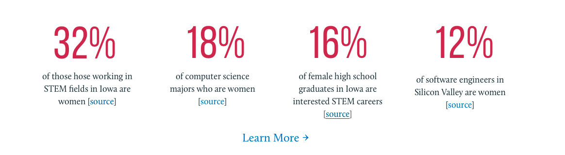
- As you can see above, Who We Are became the main content section of our new home page. As part of this section, I added 4 compelling statistics to help our supporters understand the core problem we wanted to address.
- Lastly, we needed to publicize our events, thank our community sponsors, and let people sign up for our email list. Since our events were relatively infrequent, it made sense to only list two on the home page at one time.
- By contrast, since all of our funding came from donations from the local business community, we wanted to devote a sizable amount of space to thank our sponsors.
- For our email list subscription, we didn’t have a regular newsletter, we just sent out periodic updates on our activities. I wanted to let people know what kind of content they could expect if they decided to subscribe.
I shared the design concept with the rest of the board, and they loved it. Now, it was time to implement the new design on the site.
I was hoping a volunteer would step up and implement the design, but no one really had bandwidth to do it. I wanted to at least change the information architecture and color scheme. Unfortunately, I did not have time implement all of the ideas from the design mock up.
To implement the new design, I chose a new WordPress theme that most closely matched the design concept. Then I modified that theme for our organization. This involved creating a Child theme, and modifying the CSS in key areas.
While the resulting website did not look exactly like the original design concept, it was more attractive and usable after I implemented the new navigation and hero area.
Results
After the website redesign, we had a site that had a clear information architecture and an attractive hero image highlighting girls at one of our past events. It was easier for everyone on our board to add content to the redesigned website.